1.3 Data and data analysis
|
Previous
1.2 Scientific method
|
Next
1.4 Laboratory safety procedures
|
1.3 Data and data analysis (ESCHX)
In order to analyse the data obtained during experiments it is often necessary to convert that data into different representations. One type of representation is a graph. A few examples are given here.
How to draw graphs in science (ESCHY)
For all graphs plotted from experimental data it is important to remember that you should never connect the dots. Data will never follow a line or curve perfectly. By obtaining multiple experimental data points any discrepancies in each data point can be removed. The line added after the points are plotted should be a best fit line that can then be used to more accurately determine further information.
Features of graphs you plot:
-
An appropriate scale is used for each axis so that the plotted points use most of the axis/space (work out the range of the data and the highest and lowest points).
-
The scale must remain the same along the entire axis and should use easy intervals such as 10's, 20's, 50's. Use graph paper for accuracy.
-
Each axis must be labelled with what is shown on the axis and must include the appropriate units in brackets, e.g. Temperature (\(^{\circ}\)C), time (seconds), height (cm).
-
The independent variable is generally plotted along the x-axis, while the dependent variable is generally plotted along the y-axis.
-
Each point has an x and y co-ordinate and is plotted with a symbol which is big enough to see, e.g. a cross or circle.
-
A best fit line is then added to the graph.
-
Do not start the graph at the origin unless there is a data point for (0,0), or if the best fit line runs through the origin.
-
The graph must have a clear, descriptive title which outlines the relationship between the dependent and independent variable.
-
If there is more than one set of data drawn on a graph, a different symbol (and/or colour) must be used for each set and a key or legend must define the symbols.
-
Use line graphs when the relationship between the dependent and independent variables is continuous.
-
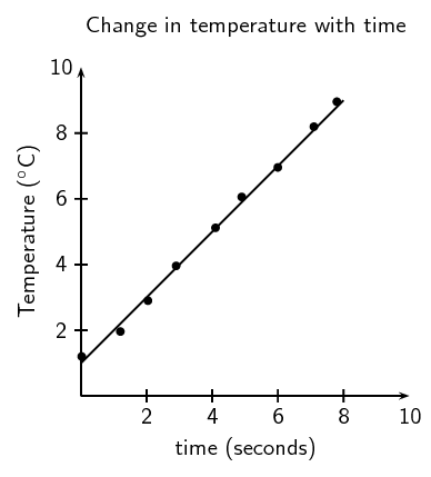
For a line graph, you can draw a line of best fit with a ruler. The number of points are distributed fairly evenly on each side of the line (see Figure 1.11).
-
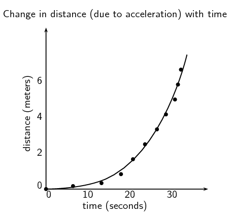
With an exponential graph (when the points appear to be following a curve) you can draw a best fit line freehand (see Figure 1.12).

Figure 1.11: A straight line graph of the change in temperature with time.

Figure 1.12: A graph with an exponential best fit line.
Remember that without units much of our work as scientists would be meaningless. We need to express our thoughts clearly and units give meaning to the numbers we measure and calculate. Depending on which units we use, the numbers are different. For example if you have 12 water, it means nothing. You could have 12 ml of water, 12 litres of water, or even 12 bottles of water. Units are an essential part of the language we use. Units must be specified when expressing physical quantities.
Qualitative and quantitative analysis (ESCHZ)
Qualitative analysis
In qualitative research you look at the quality of a substance. At how it looks compared to other cases. You do an in-depth analysis of a specific case, and then make an informed decision about similar cases.
For example, a qualitative study of the study habits of university students could include only a few people, or over twenty. Each person would be asked in-depth questions about how they study, and what works for them, and a general, informed assertion can then be made about these study habits.
Quantitative analysis
In quantitative research you look at specific numbers. You study a large group (data sample) and do statistical analyses of the group, with experimental controls, manipulation of variables, and the modelling and analysis of your data.
For example, a quantitative study of those same study habits of university students would include a large number of people, for statistical relevance. The questions asked would include raw data of actual studying hours, and the most productive study times. These data points would then be analysed using graphical models.
This is the second part of the boiling points and rate of evaporation experiment.
Results
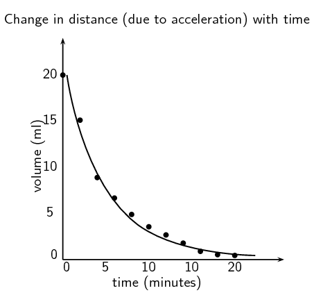
Learners should record their results in a table like the one given. They should then plot a graph of all four liquids on the same set of axes. An example of how the drop in nail polish remover might look is given below.

Discussion and conclusion
Learners should find that water takes the longest time to evaporate and so has the shallowest drop on their graph. Water has strong intermolecular forces (hydrogen bonds). Ethanol (\(\text{CH}_{3}\text{CH}_{2}\text{OH}\)) and methylated spirits (mainly ethanol (\(\text{CH}_{3}\text{CH}_{2}\text{OH}\)) with some methanol (\(\text{CH}_{3}\text{OH}\))) both have hydrogen bonds but these are slightly weaker than the hydrogen bonds in water. Nail polish remover (acetone (\(\text{CH}_{3}\text{COCH}_{3}\))) has dipole-dipole forces only and so evaporates quickly and will have the sharpest decrease on their graph.
The graph should be exponential and as time increases the dependent variable (volume) decreases.
Boiling points and rate of evaporation: Part 2
Results
Now that you remember how to plot graphs, go back to the data you obtained during the previous experiment.
-
On the same set of axes, plot a graph of the volume (ml) versus the time (min) for each substance.
Analysis of results or discussion
-
Analyse the results plotted on the graphs and the table.
-
Which substance has the fastest decrease in volume? Which has the slowest decrease?
-
Discuss if there are any relationships between your independent (time) and dependent (volume) variables (what type of graph did you plot?).
-
It is important to look for patterns/trends in your graphs or tables and describe these clearly in words.
-
Compare the different graphs and the different rates of evaporation to the boiling points of the substances.
Evaluation of results
-
This is where you answer the question Is the rate of evaporation of a substance related to its boiling point?
-
You need to carefully consider the results:
-
Were there any unusual results? If so then these should be discussed and possible reasons given for them.
-
Discuss how you ensured the validity and reliability of the investigation. Was it a fair test (validity) and if the experiment were to be repeated would the results obtained be similar (reliability)? The best way to ensure reliability is to repeat the experiment several times and obtain an average.
-
Discuss any experimental errors that may have occurred during the experiment. These can include errors in the methods and apparatus. Make suggestions on what could be done differently next time.
-
Did this experiment yield qualitative or quantitative results?
-
Conclusions based on scientific evidence (ESCJ2)
Boiling points and rate of evaporation: Part 3
Conclusion
You have your results, and the analysis of your results. Now you need to look back at your hypothesis.
The conclusion needs to link the results to the aim and hypothesis. In a short paragraph, write down if what was observed supports or reject the hypothesis. If your original hypothesis does not match up with the final results of your experiment, do not change the hypothesis. Instead, try to explain what might have been wrong with your original hypothesis. What information did you not have originally that caused you to be wrong in your prediction.
Conclusions and bias
Read the following extract on bias taken from radiology.rsna.org (01/09/13), and answer the questions that follow:
Bias is a form of systematic error that can affect scientific investigations and distort the measurement process. A biased study loses validity in relation to the degree of the bias. While some study designs are more prone to bias, its presence is universal. It is difficult or even impossible to completely eliminate bias. In the process of attempting to do so, new bias may be introduced or a study may be rendered less generalizable. Therefore, the goals are to minimize bias and for both investigators and readers to comprehend its residual effects, limiting misinterpretation and misuse of data.
-
In the light of the above quotation, why is it important for you to clearly state all your experimental parameters?
-
Why is it important never to try and make the data fit your hypothesis?
-
Look again at the conclusions you drew during your experiment.
-
Are they biased?
-
Did you make any assumptions based on preconceived ideas?
-
Is the data presented in a clear way that does not force a reader to agree with your conclusions?
-
In this activity, learners could mention topics such as more direct sunlight on one container, higher volatility (though that is related to intermolecular forces), a breeze speeding up the rate of evaporation over one or more of the containers, and water vapour in the air slowing down the rate of evaporation for water.
The main point of this activity is that they understand that there can be more than one explanation for a set of data, which why repeating an experiment, doing thorough background research, and not having their ideas fixed before analysing data is so important.
Different, but acceptable explanations for the same set of experimental data.
To prevent bias, it is important to be able to look at the same information in different ways, to make sure your conclusion is the most logical one.
Divide into groups of three or four and and compare the conclusions you drew from the boiling points and rate of evaporation experiment, and answer the questions that follow:
-
Did anyone in the group draw a different conclusion from the one you drew?
If yes, discuss the merits and short-falls of the different conclusions.
-
Did your conclusion match what you were expecting to find from the hypothesis?
-
Can you think of any other explanation that would explain your data?
-
Many natural medicines were used by people long before any studies were performed. These plants were tried and tested by people, and were known to help with many different ailments. Many people seek alternative forms of treatment. In South Africa, individuals commonly use traditional medicines like African Potato (Hypoxis hemerocallidea) and ”Cancer bush” (Sutherlandia frutescens), to boost the immune system while undergoing conventional treatments.
The cancer bush (Sutherlandia frutescent, uNwele) is an indigenous medicinal plant which the Khoi and Nama people used to wash wounds and to reduce high fevers. The early settlers also used this bush to treat chicken pox, eye problems and internal cancers. Cancer patients often lose weight and suffer muscle wastage and a tonic made from this bush may improve appetite, decreases anxiety and slows down the weight loss.
-
A reliable way of navigating is by using the stars. The stars move so slowly you would only notice a change in about ~\(\text{50 000}\) years, and only in ~\(\text{100 000}\) years would the constellations look different enough to need a new star map. So we can say the constellations are made up of fixed stars.
The Earth, on the other hand, spins at \(\text{1 674,4}\) \(\text{km.h$^{-1}$}\) causing the fixed stars to rise and set (including the Sun) every day, and depending on your latitude they will rise and set at specific coordinates, hence you can calculate your latitude if you know the coordinates of the stars you can see.
In the Southern hemisphere we use the Southern Cross to find South. In the northern hemisphere the Pole star can be used to find North.
Determining your longitude is a bit more complicated, unless you have an accurate clock. This is why one of the essential tasks a sailor had in the past was to reset the ship clock before continuing the voyage, and why all major sea ports had observatories, to provide sailors with reliable times.
The stars tell you the time and the direction, so you know when and where you are on Earth. Until very recently in our history, before satellites and digital technology, stars where the most reliable way to navigate at sea, where there are no landmarks.
Similarly to every culture across the world, the peoples of Africa, and more locally Southern Africa used the stars as a canvas for their mythologies. The stars were also used as agricultural calendars. A few brief examples include:
-
the people living along the Nile in ancient Egypt knew that when Sirius was seen just before sunrise the Nile would flood,
-
all over Africa, the IsiLimela or the Pleiades, a star cluster in Taurus, were used to indicate the start of the growing season. They are also called the `digging stars', and
-
the Venda people saw the Southern Cross and Pointers as giraffes, and in October when the `giraffes' were just above the trees in the evening they new it was time to finish planting.
-
Methods of knowing used by non-scientists.
Research one of the following topics and report your findings to the class in a five minute oral presentation:
-
Traditional medicines.
-
Navigation and knowledge of the seasons, from the stars.
Designing a model (ESCJ3)
Sometimes a system is too large to be studied, or too difficult to recreate experimentally. In these cases it is possible to design a model based on a smaller system, that fits the data observed for the larger system. Here are some key points to remember when designing a model:
-
A model is a testable idea that describes a large system that is not easily testable.
-
The model should be explain as many observations of the large system as possible, and yet be relatively simple.
An example of a model was the spherical model of the Earth, rather than a flat one.
-
Many educated people of the day (in the late 1400s) knew that the Earth could not be flat due to observations that did not fit. A spherical Earth model was proposed, which was testable on a small scale.
-
The model explained many previously unexplained phenomenon (such as that ships appeared to sink over the horizon, regardless of the direction of travel).
-
The model was further verified by the shape of the Earth's shadow on the moon during lunar eclipses.
|
Previous
1.2 Scientific method
|
Table of Contents |
Next
1.4 Laboratory safety procedures
|
